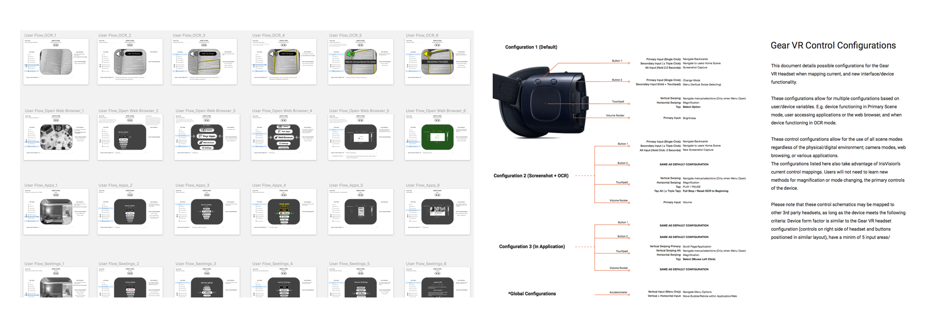
A Los Angeles product team needed a UX director to structure their feature roadmap and design the initial interface for their VR GUI. I managed the design and strategy roadmap, delivered designs for system and application UIs, and conducted numerous user testing and validation studies.
Does it seem like the designs are a bit too simple? Where are the cool gradients and shadows? It should look something like inside of Iron Man's helmet right?
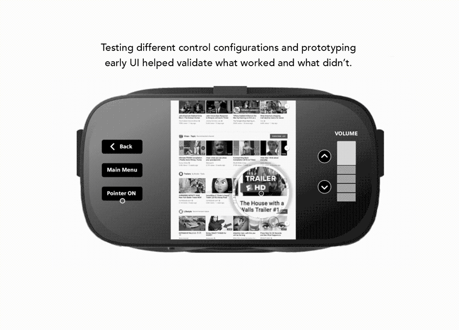
There's a reason for the high contrast colors, thick object borders, and simple iconography. These details which become very apparent through sparse UI properties help our primary user base of the product, the visually impaired.
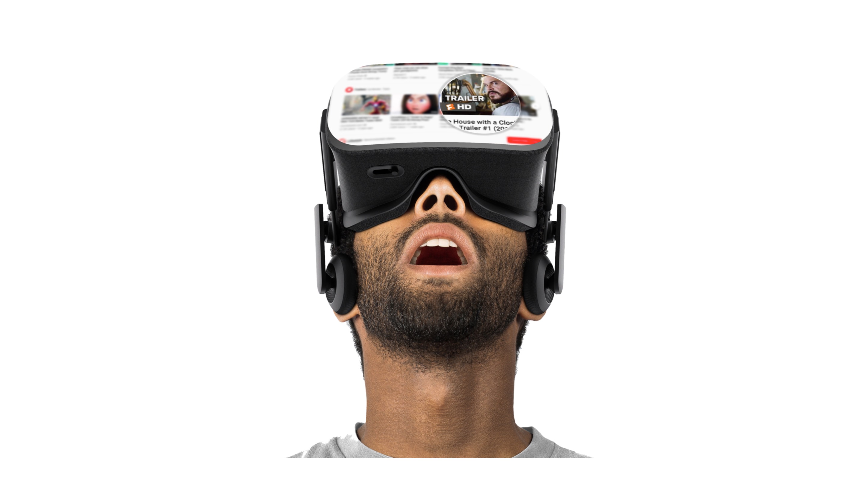
IrisVision is a virtual and augmented reality product for the legally blind, or persons with low vision. Their product helps thousands of people with limited vision see and interact with the world around them. Soon IrisVision will
roll out new features and custom applications which will allow users to not only interact with the physical world, but also the digital world, and everything that's connected to it.
Keep it simple. A constant struggle, but one worth fighting for. Limit functionality to only the critical features and controls for using the product - Most users are adopting this unique VR device to achieve specific tasks - Once you can define these dependencies everything else becomes secondary and falls into line.