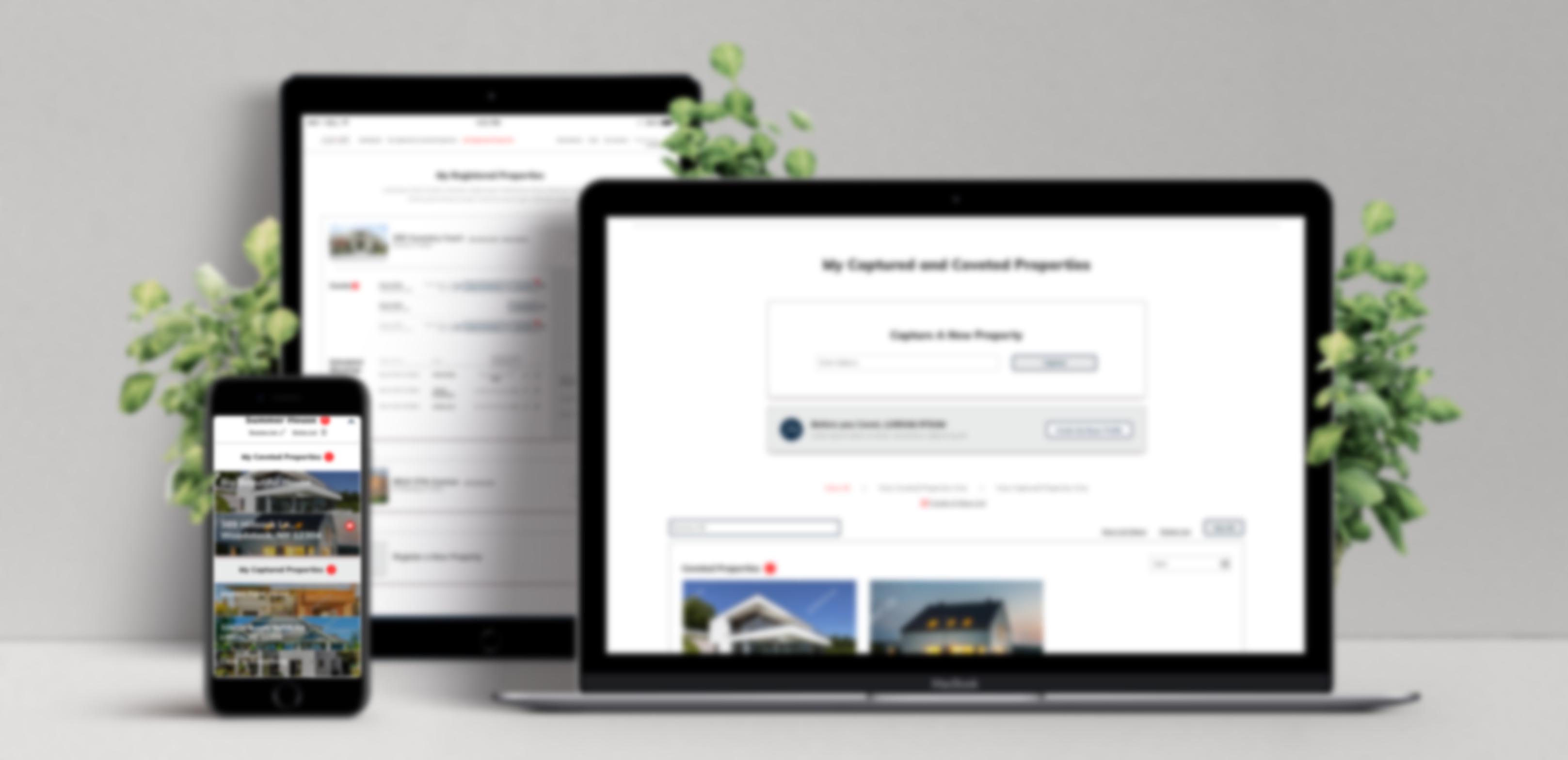
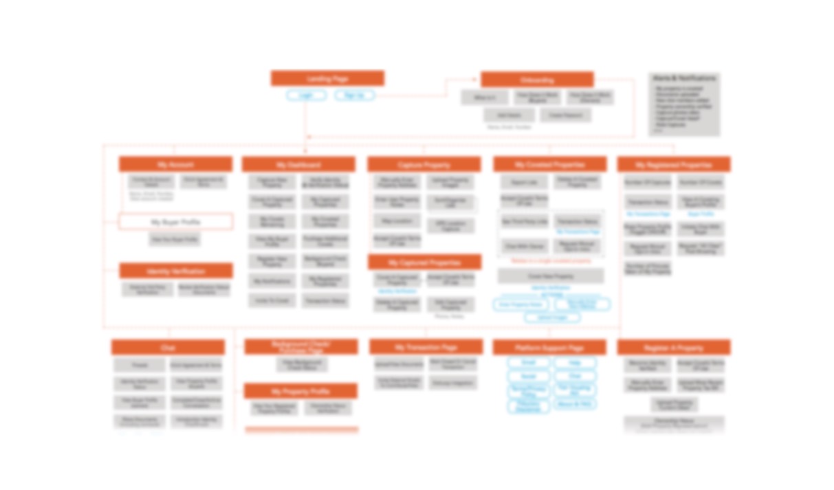
A private client hoped to build a revolutionary real estate platform - FSBO (for sale by owner). This product allowed for contacting home owners and purchasing million dollar+ properties which were not listed openly on the market. My team helped to design not only a great user experience but also an entire platform, taking the client's concepts and developing them into a functional product roadmap. Through heavy client interaction and an iterative design approach, deliverables included sitemaps, user flows, 300+ pages of annotated UX mock-ups, and fully functioning prototypes to help secure investment funds taking the product to its next phase of production.
When working with young or seasoned entrepreneurs it's necessary to help them solidify the highest priority product goals during project kickoff. In summary, these basic goals should state the underlying foundation of the application, what problem it solves, who the target audience/user/consumer is, and what the founding individuals hope to achieve by launching said product. [Is it to eventually sell the product or application to the highest bidder? Try and turn profits after 365 days? Build a lifetime long-engagement ecosystem?]
Understanding the application you’re building and who’s meant to use it is important, but it's critical to see what’s driving this entrepreneur to even engage in building such a product or tool. This last point helps to align the product vision across all stakeholders and maintain a clear roadmap ahead. Whenever the product and its features seem to be diverging from this, the product lead should ask - Does this action, implementation or change help to achieve the main product goal and vision? When building this real estate platform from scratch over five months, many of these team alignment tools helped save precious time when the client wanted to divert or add features.
Navigation -
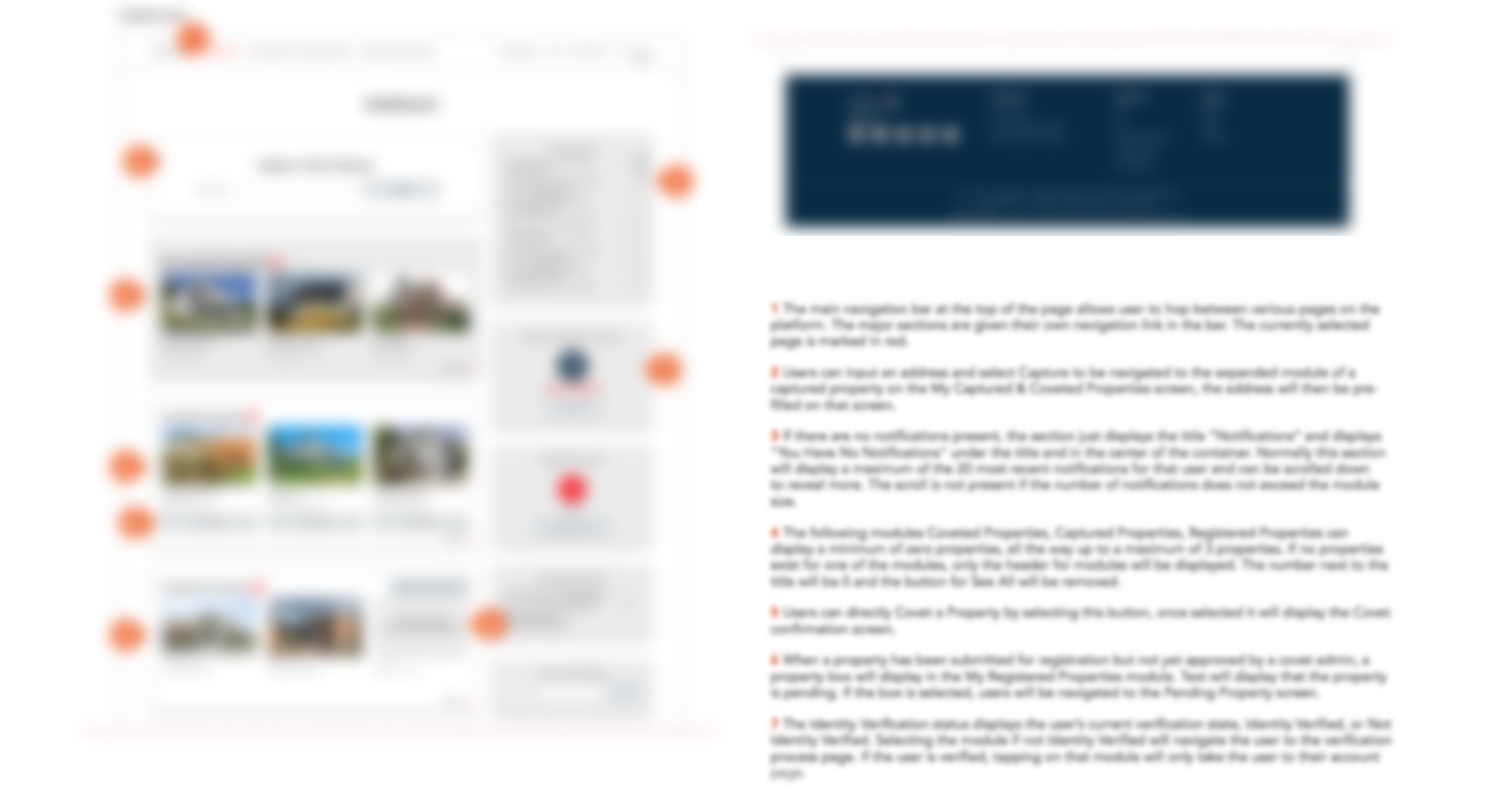
Goal one was to make a product that easily introduced this new type of property purchasing system. Due to the nature of this innovative product we needed to find ways to easily convey the intricacies of how our new system worked, and without adding complicated onboarding screens. [As a rule of thumb, if the application or product needs more than one screen of instructions, it’s already failed. Best is 0 screens.] By ensuring our design schemas kept close ties with the larger umbrella of real estate apps, our user base could take advantage of their own affordances (understandings of interactions based on previous experience). Common design elements included reusing popular iconography layered on top of salient titles to help describe menu functions and actions. This allowed users to always have an easy way of navigating back to a section they understood in the event they got confused or lost while exploring features.
Language -
Another particular struggle was the legal language needing to be present for users to accept before performing critical application tasks. Initially the client was hard set to introduce this language at the onset of user registration. Helping the stakeholders understand how barrier to entry could be reduced by half, preventing significant bounce rates, was a turning point for this application. By understanding the fundamentals of why users needed to accept those terms, our team was able to present the language after users had time to interact, gain interest and become invested in the platform. This language was now presented after users wanted to re-engage with home owners to discuss a possible purchase of properties. Moving the language further down the user flow allowed time for a "hook" to be formed in users' habitual patterns, giving them reasons for returning to the application.